# Core Widgets
# Overview
ezFlap Core Widgets are thin wrappers around native Flutter widgets.
Core Widgets "convert" native Flutter behaviors to the ezFlap approach.
For example, Core Widgets converts Flutter event callbacks to ezFlap events that are handled with z-on.
As another example, for input widgets, Core Widgets allow getting and set the input using z-model.
Core Widgets accept all the native parameters their wrapped Flutter widget accepts, except for parameters that are handled with the ezFlap approach instead.
For example, a Core Widget will not accept a callback function as an onTap event handler, because the onTap event
would be emitted as an ezFlap event and handled with z-on instead.
Core Widgets are named after the native Flutter widgets they wrap, with the prefix Ez.
All Core Widgets are listed below, in alphabetical order.
# Keys
All Core Widgets accept a key prop, of type Key.
The value passed in this prop is passed down to the hosted native widget.
KEY NOT APPLIED TO THE CORE WIDGET ITSELF
Note that the key is only passed down to the hosted widget, and is not applied for the Core Widget itself.
This is useful in testing, when we normally want to find the actual input widgets and not their wrapper Core Widget.
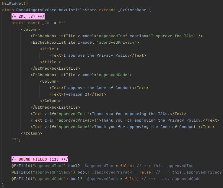
# EzCheckboxListTile
- Wraps: CheckboxListTile
- Special inputs:
- Unnamed model.
- Optional.
- Type:
bool?.
- Prop:
child.- Optional.
- Type:
Widget?. - Passed to
CheckboxListTile.titleiftitleis not provided.
- Prop
caption.- Optional.
- Type:
String. - Wrapped in Text and passed to
CheckboxListTile.titleif bothchildandtitleare not provided. Ifcaptionis not provided as well - then an empty string is used.
- Prop
isDisabled.- Optional.
- Type:
bool. - Default value:
false.
- Unnamed model.
- Events:
- Emits
changed.- Signature:
void Function(bool? value). - Emitted when the checkbox is ticked or unticked.
- Signature:
- Emits
# Example
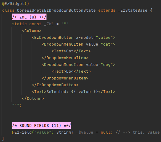
# EzDropdownButton
- Wraps: DropdownButton
- Special inputs:
- Unnamed model.
- Mandatory.
- Type:
dynamic.
- Unnamed children.
- Optional.
- Type:
List<DropdownMenuItem<dynamic>>. - When provided - passed to
DropdownButton.items.
- Prop
isDisabled.- Optional.
- Type:
bool. - Default value:
false.
- Unnamed model.
- Events
- Emits
changed.- Signature:
void Function(dynamic value). - Emitted when the selected item changes.
- Signature:
- Emits
tap.- Signature:
void Function(). - Emitted when the dropdown button is tapped.
- Signature:
- Emits
# Example
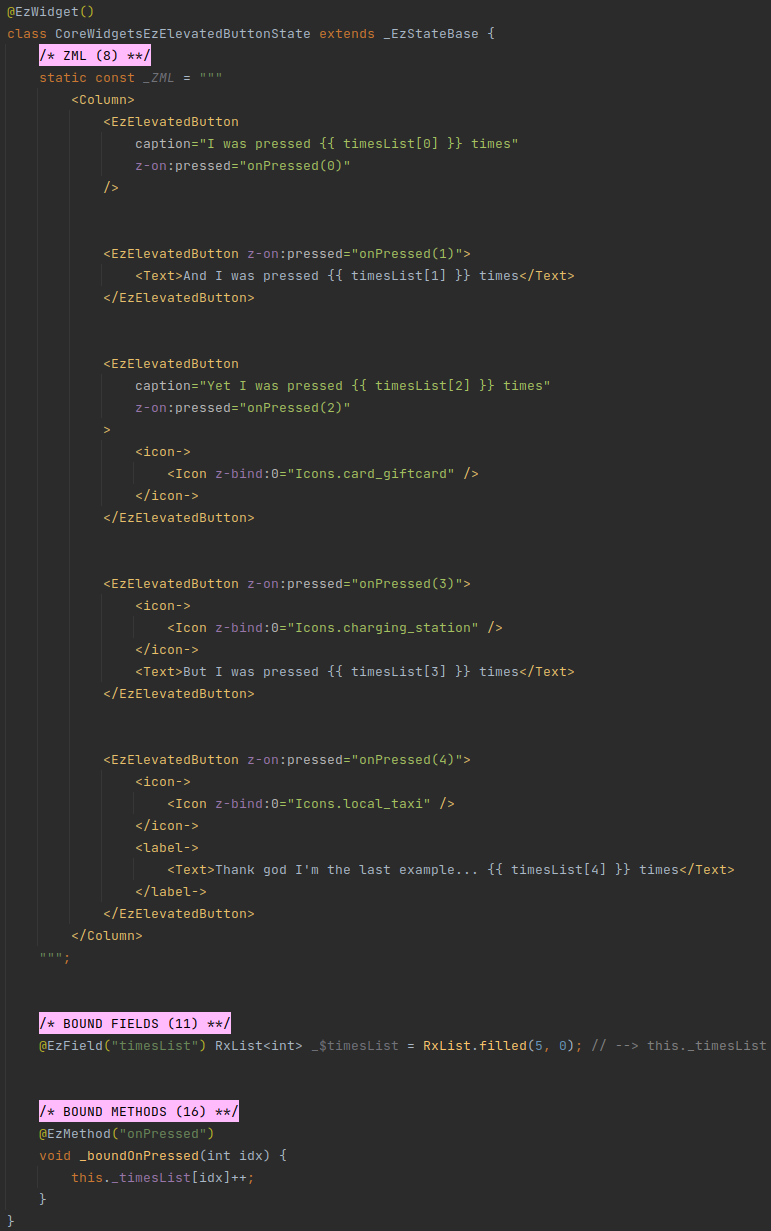
# EzElevatedButton
- Wraps: ElevatedButton
- Special inputs:
- Prop
caption.- Optional.
- Type:
String?. - If
childis not provided - Text withcaptionis used instead.
- Prop
icon.- Optional.
- Type:
Widget?. - When provided - the
ElevatedButton.icon()constructor is used.
- Prop
label.- Optional.
- Only used when
iconis also provided. - If provided - passed to
ElevatedButton.label. Otherwise -childwill be used. Ifchildis not provided - thencaptionwill be wrapped in a Text widget and used.
- Prop
isDisabled.- Optional.
- Type:
bool. - Default value:
false.
- Prop
- Events:
- Emits
pressed.- Signature:
void Function(). - Emitted when the button is pressed.
- Signature:
- Emits
longPress.- Signature:
void Function(). - Emitted when the button is long-pressed.
- Signature:
- Emits
# Example
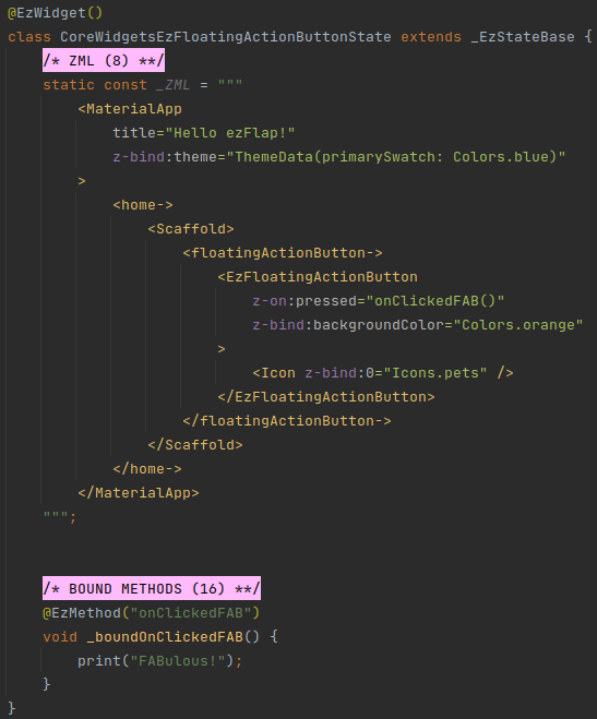
# EzFloatingActionButton
- Wraps: FloatingActionButton
- Special inputs:
- Prop
isDisabled.- Optional.
- Type:
bool. - Default value:
false.
- Prop
- Events:
- Emits
pressed.- Signature:
void Function(). - Emitted when the button is pressed.
- Signature:
- Emits
# Example
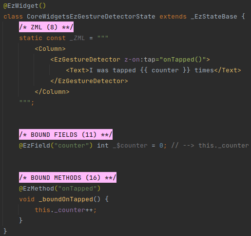
# EzGestureDetector
- Wraps: GestureDetector
- Events:
- Emits events for all
on*callbacks that can be provided to the native GestureDetector (e.g.tapDown,tapUp,tap,forcePressPeak,scaleStart, etc.).
- Emits events for all
# Example
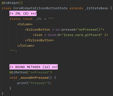
# EzIconButton
- Wraps: IconButton
- Special inputs:
- Prop
child.- Optional.
- Type:
Widget?. - If
childis provided - it is used as the icon (i.e. it is passed to IconButton in theiconparameter).
- Prop
isDisabled.- Optional.
- Type:
bool. - Default value:
false.
- Prop
- Events:
- Emits
pressed.- Signature:
void Function(). - Emitted when the button is pressed.
- Signature:
- Emits
# Example
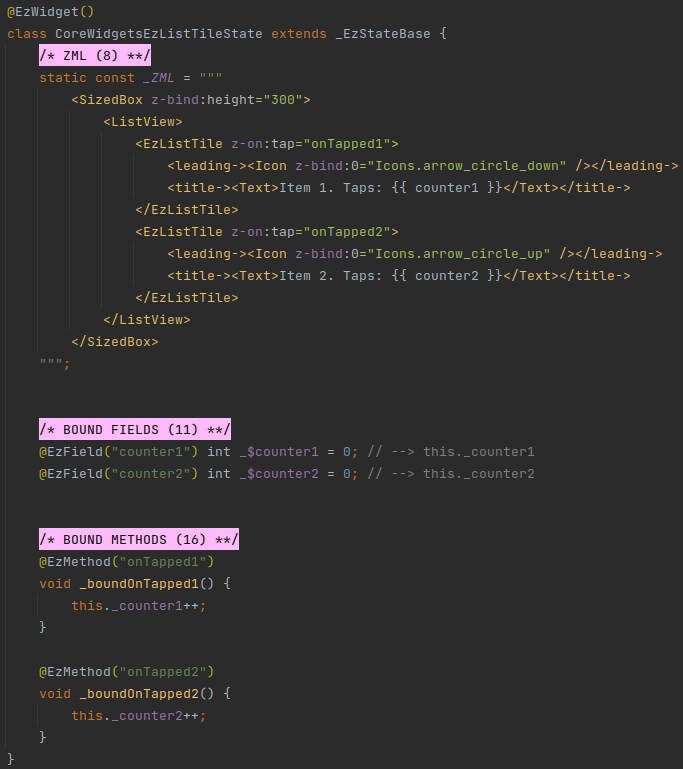
# EzListTile
- Wraps: ListTile
- Events:
- Emits
tap.- Signature:
void Function(). - Emitted when the tile is tapped.
- Signature:
- Emits
longPress.- Signature:
void Function(). - Emitted when the tile is long-pressed.
- Signature:
- Emits
# Example
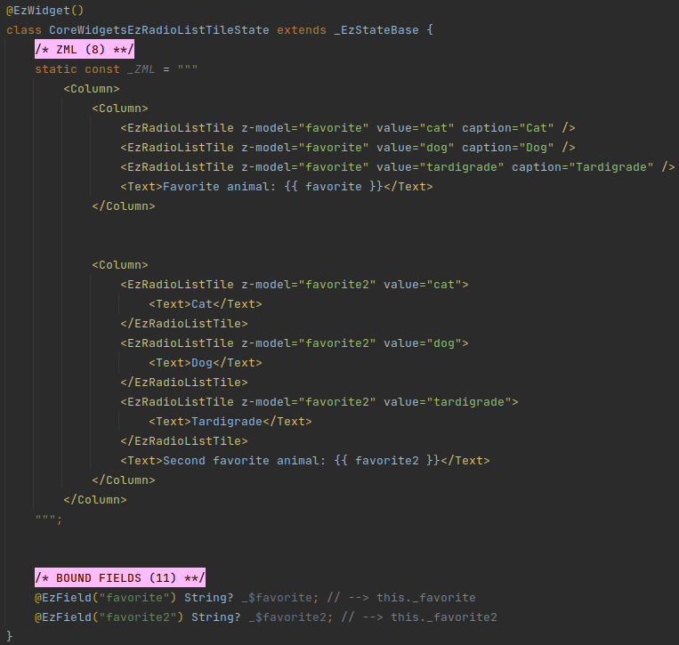
# EzRadioListTile
- Wraps: RadioListTile
- Special inputs:
- Unnamed model.
- Mandatory.
- Type:
dynamic(but should be the same actual type as thevalueprop).
- Prop
value.- Mandatory.
- Type:
dynamic(but should be the same actual type as the unnamed model).
- Prop:
child.- Optional.
- Type:
Widget?. - Passed to
RadioListTitle.titleiftitleis not provided.
- Prop:
caption.- Optional.
- Type:
String?. - Wrapped in Text and passed to
RadioListTitle.titleif bothchildandtitleare not provided. Ifcaptionis not provided as well - then an empty string is used.
- Prop
isDisabled.- Optional.
- Type:
bool. - Default value:
false.
- Unnamed model.
- Events:
- Emits
changed.- Signature:
void Function(dynamic value). - Emitted when the radio is ticked.
- Signature:
- Emits
# Example
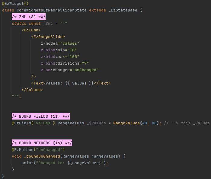
# EzRangeSlider
- Wraps: RangeSlider
- Special inputs:
- Unnamed model.
- Mandatory.
- Type:
RangeValues.
- Prop
isDisabled.- Optional.
- Type:
bool. - Default value:
false.
- Unnamed model.
- Events:
- Emits
changed.- Signature:
void Function(RangeValues values). - Emitted on
RangeSlider.onChanged.
- Signature:
- Emits
changeStart.- Signature:
void Function(RangeValues values). - Emitted on
RangeSlider.onChangeStart.
- Signature:
- Emits
changeEnd.- Signature:
void Function(RangeValues values). - Emitted on
RangeSlider.onChangeEnd.
- Signature:
- Emits
# Example
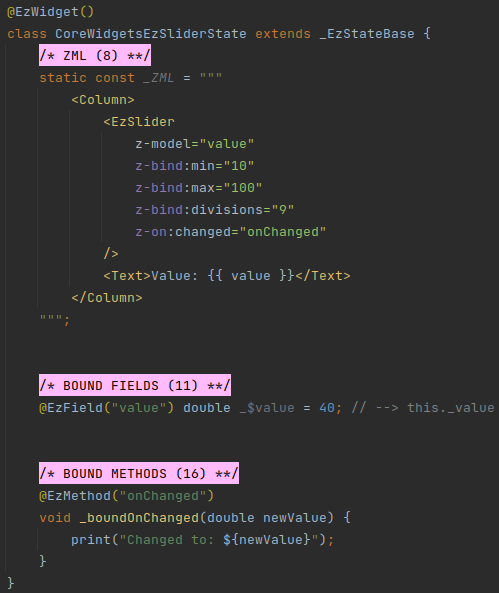
# EzSlider
- Wraps: Slider
- Special inputs:
- Unnamed model.
- Mandatory.
- Type:
double.
- Prop
isDisabled.- Optional.
- Type:
bool. - Default value:
false.
- Unnamed model.
- Events:
- Emits
changed.- Signature:
void Function(double values). - Emitted on
Slider.onChanged.
- Signature:
- Emits
changeStart.- Signature:
void Function(double values). - Emitted on
Slider.onChangeStart.
- Signature:
- Emits
changeEnd.- Signature:
void Function(double values). - Emitted on
Slider.onChangeEnd.
- Signature:
- Emits
# Example
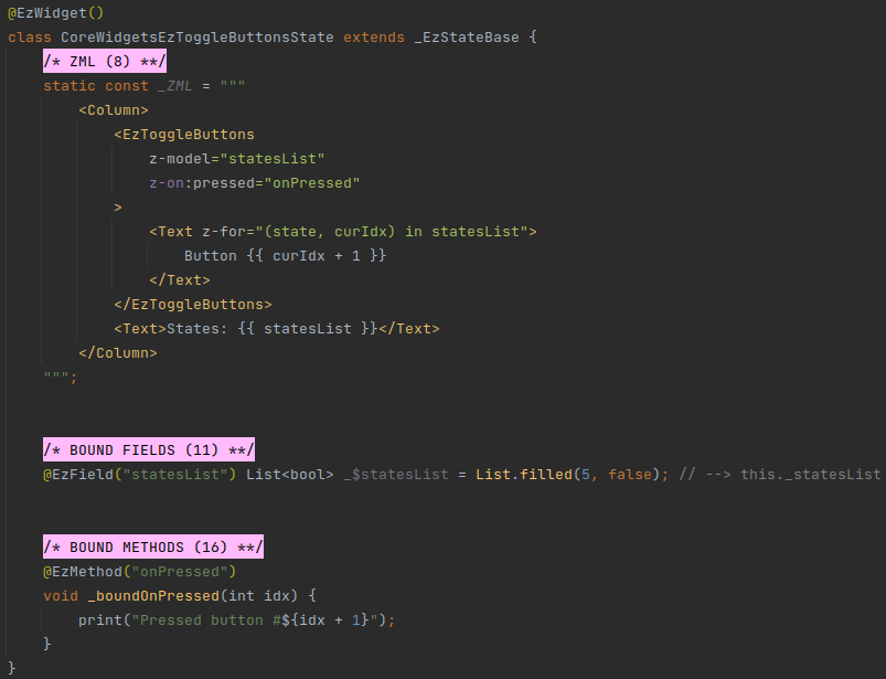
# EzToggleButtons
- Wraps: ToggleButtons
- Special inputs:
- Unnamed model.
- Optional.
- Type:
List<bool>.
- Prop
isDisabled.- Optional.
- Type:
bool. - Default value:
false.
- Unnamed model.
- Events:
- Emits
pressed.- Signature:
void Function(int idx). - Emitted when one of the
childrenis pressed.
- Signature:
- Emits
# Example
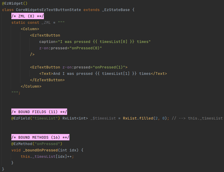
# EzTextButton
- Wraps: TextButton
- Special inputs:
- Prop
caption.- Optional.
- Type:
String?. - If
childis not provided - Text withcaptionis used instead.
- Prop
isDisabled.- Optional.
- Type:
bool. - Default value:
false.
- Prop
- Events:
- Emits
pressed.- Signature:
void Function(). - Emitted when the button is pressed.
- Signature:
- Emits
longPress.- Signature:
void Function(). - Emitted when the button is long-pressed.
- Signature:
- Emits
# Example
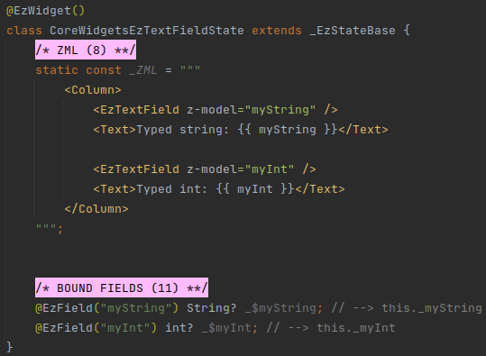
# EzTextField
- Wraps: TextField
- Special inputs:
- Unnamed model.
- Optional.
- Type:
dynamic.
- Unnamed model.
- Events:
- Emits
changed.- Signature:
void Function(String value). - Emitted on
TextField.onChanged.
- Signature:
- Emits
editingComplete.- Signature:
void Function(). - Emitted on
TextField.onEditingComplete.
- Signature:
- Emits
tap.- Signature:
void Function(). - Emitted on
TextField.onTap.
- Signature:
- Emits
submitted.- Signature:
void Function(String value). - Emitted on
TextField.onSubmitted.
- Signature:
- Emits
appPrivateCommand.- Signature:
void Function(String value, Map<String, dynamic> map). - Emitted on
TextField.onAppPrivateCommand.
- Signature:
- Emits
# Controller
Unlike TextField, EzTextField does not accept a controller prop.
EzTextField has its own controller. Value updates to and from the text field are done using the unnamed model.
Additional capabilities may be added in a future version of this widget.
# Casting
The type of EzTextField's unnamed model is dynamic.
If the model actually provided from the host is not a String? - the content of the text field will be set to the
String representation of the provided value (i.e. using toString()).
As the user edits the text in the text field, the model will be updated.
If the actual model is of type int?, double?, or num? - then the context of the textbox will be parsed and the
resulting number (or null, if the value can't be parsed) - will be assigned to the model.
CAVEAT
In order for the actual model type to be detected correctly, the model must be provided from a bound field of the host component.
In other words, if the value passed in z-model at the host widget is also an @EzModel at the host side - then this
won't work.
In such case - use String or String?.
# Example
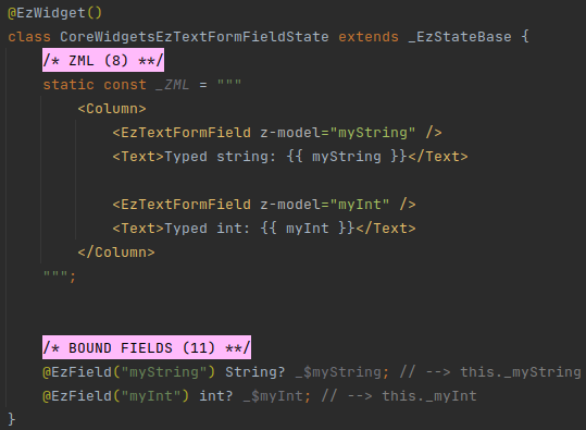
# EzTextFormField
- Wraps: TextFormField
- Special inputs:
- Unnamed model.
- Optional.
- Type:
dynamic.
- Unnamed model.
- Events:
- Emits
changed.- Signature:
void Function(String value). - Emitted on
TextField.onChanged.
- Signature:
- Emits
editingComplete.- Signature:
void Function(). - Emitted on
TextField.onEditingComplete.
- Signature:
- Emits
tap.- Signature:
void Function(). - Emitted on
TextField.onTap.
- Signature:
- Emits
fieldSubmitted.- Signature:
void Function(String value). - Emitted on
TextField.onFieldSubmitted.
- Signature:
- Emits
saved.- Signature:
void Function(String? value). - Emitted on
TextField.onSaved.
- Signature:
- Emits
EzTextFormField has the same special behaviors as EzTextField above.
# Example